OUGD406 - Signs and Symbols

As a away of creating and producing potential visual content for the flag design, Signs and symbols were a great reference point. The book - Signs and Symbols by Adrain Frutiger contains a wealth of information on this including pictograms, symbology, basic visual hierarchy and how different basic shapes are interpreted by humans.
In one chapter, Frutiger talks about Morphology and how by using a simple structure - 3 horizontal and 3 vertical lines - certain characteristics are associated with different variations. As an exercise in this, we associated a few different words with the different symbols, theses were: object, cup, protection, beginning and end.

 Looking through the book, the parts which best apply to Art-Rock as a micro-genre are the parts about symbology. With Art-Rock being a more intellectual and complex genre of rock music, aspects like the lyrics and artwork tend to contain a lot of hidden meanings and symbolism. Frutiger states - “This symbolic element in pictures is an implied value, a mediator between recognisable reality and the mystical, invisible realm of religion, philosophy, and magic”. With Art-Rock’s tendency towards otherworldly or unexplainable concepts and themes, which can be seen in albums such as Dark Side of the Moon, Magical Mystery Tour and Sgt Pepper’s, this statement applies well because these artists use the same symbolic imagery that Frutiger talks about to create an intellectual, immersive and creative experience. This idea is seen even further when looking at the symbology of Ancient Egyptian Coffins which contain a multitude of symbols, imagery and pictograms arrayed in a tableau not unlike the cover for Sgt Peppers.
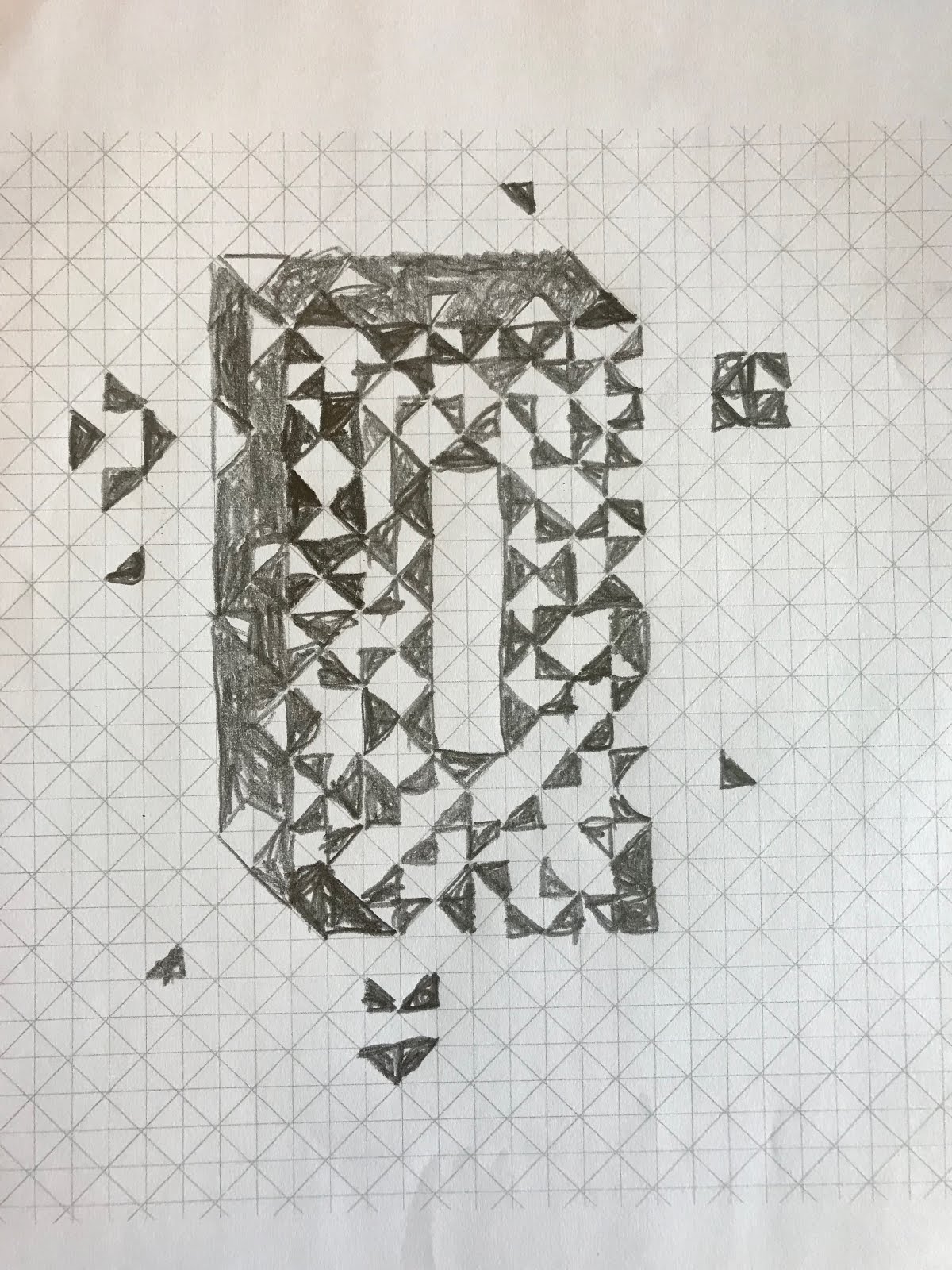
We also experimented with using 45 degree grid systems to create geometric symbols based on a specific micro-genre and thought of words which summarise our micro genres so that others could generate imagery imbued simple by those words. The most successful design was probably the kaleidoscope design which was indicated by a group critique suggesting bright colours and psychedelia be explored with it as well. This development would be more in keeping with accurately representing art rock as a genre because while this was a useful exercise which helped in thinking about imagery which summarises our specific micro genre, the imagery produced didn’t really match the style of art rock well as they were to geometric and contemporary and art rock requires more figurative and expressive imagery.


No comments:
Post a Comment