Showing posts with label OUGD503 - SB1. Show all posts

Friday, 8 February 2019

Street Sign Production

 Producing the road sign took some production skills and self evaluation; spray paining with a stencil onto a laser cut acrylic sign was decided as the way to go forward as it would have a more definite and smoother finish then using vinyl for the type. The first wood stencil didn’t work as it had a slight bend, meaning the type did not have clean lines and was a bit blurred, but developing from this, a vinyl stencil was produced and stuck down, which ensured a refined and professional finish.


Tuesday, 5 February 2019

Abbey Road Final Posters

Once the design was finalised, 2 other posters were created to make a set of 3. They both use primary/tertiary contrasting inverse colours just like the first one, further cementing the idea of contrast but giving them some variation. The first poster reads ‘Come Together’ which was used to promote the idea of literally coming together, a positive message which is relevant to the uk right now and spreads the Beatles message of peace and love. For the other 2 posters the phrases ‘Here Comes the Sun’ and ‘Carry that Weight’ were used; other along titles from the album which also have a similar positive message. 


I’m happy with the finished posters, I think they display the typeface well, are evocative of the album and really communicate this idea of contrast and two things coming together with harmony. 

Abbey Sans Poster Development

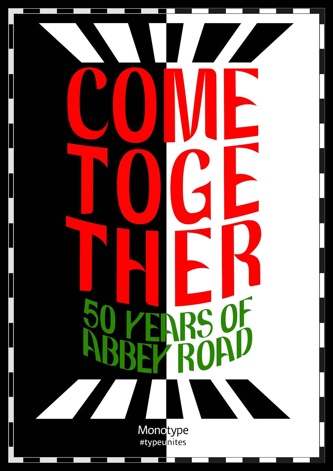
One of the first developments that went well was warping the type slightly - I was cautious about this because obviously showcasing the typeface is quite important and I didn’t want it to be modified too much, however with a small lower arch warp, it just makes the composition a little more visually intriguing and references psychedelic posters a little bit. I also tried out a banner on the ’50 years of abbey road’ but it looked a bit naff, I thought it would highlight the celebratory tone of the posters but it’s a visual device which has been used a lot so decided against it.

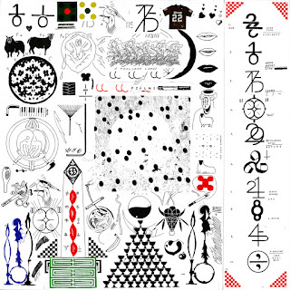
The next developments were informed by some research on Eric Timothy Carlson’s design for Bon Iver’s album ’22 a Million’. The album artwork and supporting designs are incredibly impressive and I first saw them in Creative Reviews top album artwork of 2017. The black and white album sleeve contains all sorts of symbols, glyphs and little images, which correspond to themes and different songs, which Carlson worked a lot with Justin Vernon, singer and songwriter of the band, to design. The range of different symbols, images and type clustered tightly into the design just creates something incredibly intriguing to look at, every time seeing something completely new. The deluxe edition of the vinyl contacts this intricate design with a fairly simple yin and yang design, applying red and gold with great effect. 


The Yin and Yang symbol has been associated with the Beatles before, when they’ve produced more spiritual world music on some records. It seemed like a perfect visualisation of the contrast and harmony thats part of the concept of this project. I tested it out and soon settled on a simple kind of half and half design, not using the curves or the circles; visually and conceptually, this is subtle and doesn’t overtly scream out the yin and yang symbol, which is good because obviously its very recognisable and I wouldn’t want integrating it into the composition to take over the design.


Soon after this, colour was tested in the design. Red worked quite well which was first tested as its present on road signs so it links quite well. Then green was tried out with it, which is its inverse colour, therefore they have a high contrast (linking to the concept) and visually are bold next to each other. At first these 2 colours were used just on the bottom two rows of smaller type but it actually ended up working quite nicely for the bigger type as well. The zebra crossing shapes were changed from outlines to filled in shapes to increase the contrast in the design as well.

Abbey Sans Poster Idea 5

This poster design, which sort of develops upon the black and white gridded poster from before, came after it was suggested in feedback from my presentation that I try out the monochrome colour scheme a bit more. So for this poster, I changed the hierarchy of the type so that it works better and also fills the poster nicely. The horizontal grid lines have been removed and a black and white striped border has been added, framing the composition effectively and further emphasising the idea of contrast.


This design has the most potential out of all of them so far but it does need a lot of work on it; I want to experiment with dropping in a bit of colour because right now the composition seems to fall a bit flat. 

Presentation and Feedback

For this presentation I gave a brief overview of the monotype brief, my response and my research and process, I then showed the finished typeface and these initial poster ideas. The feedback for ways to improve the project were as follows:


  • More Research - I didn’t show a lot of the research that I had done in the presentation so this feedback may be down to that, however you can never do too much research really, and now having done a fair amount on the Beatles and typography, I can now look at doing specific design related to different produced touch-points.
  • Typeface - Feedback indicated that my finished typeface was refined and looked good, when I suggested that as I undergo the next design stages, I might tweak little bits of some letterforms as and when I see it necessary, this was concurred with.
  • Posters - The feedback on my poster designs suggested that the blue and green gradient didn’t really work, as I thought, and that perhaps the monochrome gridded poster worked best. It was said that these colour choices weren’t really justified and rationalised within the design process so that was something I needed to do, but monochrome black and white may be the way to go as it supports the idea of contrast, and visually links to the zebra crossing.

  • Other Touch-points - At this point I was suggesting ideas for the other deliverables - one digital and one just anything specifically related to the project. For the digital touchpoint, it was agreed with that I do a set of different social media ads, and for the other touchpoint, I have had a few ideas, such as a redesign of the vinyl sleeve, a jacket or item of clothing with the typeface decorated on it, a type specimen or even a road sign with the typeface on it - the road sign idea was favoured as its a bit more unusual, but links well with the project and also the idea of community.

Sunday, 3 February 2019

Abbey Road Poster Idea 4

This freer and less structured variant of the previous poster takes influence from psychedelic posters of the 70’s, with large warped type filling up the poster in a bright blue. The less rationally arranged type in the foreground contrasts the geometric pattern in the back quite nicely, referencing the the concept of contrast well. While its quite a fun design, it doesn’t suit the tone of Abbey Road or the project as well as some of the other posters, if it were to be developed, the type would need to be altered within the warped pattern because in some areas its been stretched and doesn’t look as refined. Looking at some of the psychedelic type of Wes Wilson, individual letterforms in a warped arrangement all retain a certain level of structure and have been individually manipulated to both keep their form and work within the design.


Abbey Sans Poster Idea 3

This poster design uses a very much more structured grid system, using a geometric perspective pattern based on the zebra crossing on the Abbey Road album cover. As a visual device, this pattern works well to draw the viewers eye into the middle of the design where the type is. The ’50 years of abbey road’ now appearing in the abbey sans typeface, sandwiches the main line ‘come together’ however as it’s a different size and colour, it’s obvious how the type is read in the order of the visual hierarchy. The horizontal boxes of the grid system really work well to create a structured and harmonious layout. A range of colour schemes were tested out with the design, ranging from one which uses colourful gradients, which was a bit too colourful for representing Abbey Road and visually seems more suited to an album like Sgt Peppers, all the way to a black and white design which actually works quite nicely in visually representing the album, and the idea of contrast, both in concept and in visuals such as the contrasting black and white of the zebra crossing. Unfortunately when the design is just in black and white, it's harder to get a contrast between the type so its easier to read wrong. 


Abbey Sans Poster Idea 2

As a development of the last poster, this design puts the typography in a more contemporary, asymmetrical modular grid system, with the other smaller typographical elements arranged around them. The type arrangement is certainly interesting to look at and more complex then the last design, however being slightly more contemporary it is less reminiscent of the Beatles, also, having the ’50 years of abbey road’ in larger type works well as its more obvious, however maybe it should be in the Abbey Sans typeface as opposed to Acumin Pro Condensed Bold which is the typeface it’s based off of.


Abbey Road Poster Idea 1

This poster idea is fairly simple, displaying the type largely in order to give it prominence in the hierarchy of the design, Inspired by John and Yoko’s ‘War is Over’ protest signs so that the poster really has a feel of the 70’s and that community/counter culture. It also takes influence from Ed Ruscha’s work, being black type on a coloured gradient background, this was again to reference the era of the 70’s but also to add ghat feel of an advertisement which is what Ruscha based a lot of his simple typographical studies on. Abbey Road as an album, unlike say Sgt Peppers or Yellow Submarine is quite monochrome in colour scheme, however on the cover, there is the blue of the sky and the green if the trees, so that is where the colour scheme came from. The gradient background flips the same gradient of the background vertically in order to create contrast and really box the composition in. 


I quite like this poster as a simple composition but it would be interesting to do something slightly more complex to really show off the typeface in quite a bespoke design. I’m not too sure about the colours as well which obviously kind of clash a bit and seem a bit garish , and while this was the intention to start with as this can look interesting in a design sometimes, I’m not too convinced of it currently.


Abbey Sans

Commemorating the 50th anniversary of Abbey Road by The Beatles,  Abbey Sans is a cool, curved and decorative sans serif font, connecting the dots from now, back to the 70’s. This stylish typeface embodies the idea of contrast that creates harmony; rigid sans serif strokes leading into liberated curves, just like Lennon and McCartney. So in celebration of The Beatles, their music and the culture and community that would not be present in the world without them, perhaps this groovy typeface can remind everyone to put aside their differences, and really come together. 


Thursday, 31 January 2019

Abbey Sans Development

In developing this typeface, the main concern has been style and continuity; basic curves and shapes were established when creating the first few letters, and now it’s a case of replicating those for appropriate letterforms which share the same strokes. 


Looking at the typographical work of psychedelic designers such as Wes Wilson has been helpful because looking at some of the typefaces he has made, they are all undoubtedly part of a set, carrying similar shapes. While this typeface needs to be a bit more readable and contemporary, elements like this can be applied subtly. Its also helpful to look at the form of his typography and get a feel for the style.  


Faith Hardal - Contemporary Typeface Research

Faith Hardal is an Istanbul based graphic designer who focuses predominantly on typography. His experimental and decorative fonts are often less functional and legible and focus more on form and concept. Despite that they are incredibly intricate and pleasing to the eye, using visual research as key points of the typographical forms such as his gothic typeface FH Fraktur which is highly influenced by old architectural structures, a visual motif very prominent upon viewing the letterforms.


I really like the contemporary experimental nature of Hardal’s typography and its something I’d very much like to incorporate into my design for Abbey Sans. Abbey Sans needs to be readable, use curved visual letterforms reminiscent of 70’s psychedelic typography but also be relevant in a m modern day setting. I think a good way of doing this which Hardal does with his typography is using recurring shapes in each letterform and putting each letterform through the same visual system. While this didn’t work to well with my last idea for a typeface, where some letterforms didn’t work within the system and came out looking less resolved, perhaps its a case of treating groups of letterforms, with similar visual structures, differently.