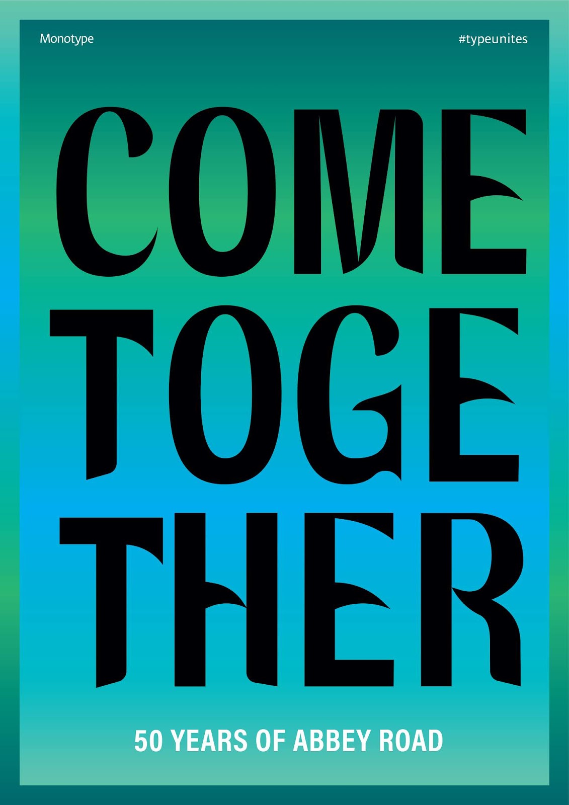
This poster idea is fairly simple, displaying the type largely in order to give it prominence in the hierarchy of the design, Inspired by John and Yoko’s ‘War is Over’ protest signs so that the poster really has a feel of the 70’s and that community/counter culture. It also takes influence from Ed Ruscha’s work, being black type on a coloured gradient background, this was again to reference the era of the 70’s but also to add ghat feel of an advertisement which is what Ruscha based a lot of his simple typographical studies on. Abbey Road as an album, unlike say Sgt Peppers or Yellow Submarine is quite monochrome in colour scheme, however on the cover, there is the blue of the sky and the green if the trees, so that is where the colour scheme came from. The gradient background flips the same gradient of the background vertically in order to create contrast and really box the composition in.
I quite like this poster as a simple composition but it would be interesting to do something slightly more complex to really show off the typeface in quite a bespoke design. I’m not too sure about the colours as well which obviously kind of clash a bit and seem a bit garish , and while this was the intention to start with as this can look interesting in a design sometimes, I’m not too convinced of it currently.


No comments:
Post a Comment