Showing posts with label OUGD505 - SB2. Show all posts

Wednesday, 8 May 2019

End of Module Self Evaluation

Overall I am pleased with the work I have produced in response to this module. Firstly I would say my concepts/ideas for both projects have been both appropriate and engaging, especially so for studio brief 2, which has quite a fun interesting concept, and subsequently is exciting to look and read through. Having this confirmed through peer feedback was very encouraging. I am also proud of the visuals I have produced for both projects; I think they’re a testament to my progression and development as a designer over the past 2 years of uni, and considering branding as an area of design I am interested in, it was really engaging to do that for one of my projects - to create a visual identity and distinct aesthetic, and carry that through various produced touch-points. While on the subject of branding and creating this visual identity, as a point that I think I could have developed with this project, I would have liked to push this visual identity even further. I believe what I produced was definitely sufficient enough for the project, and to communicate the correct message, but I would have found it personally engaging to create more outputs and really try and make the visual identity as succinct and effective as possible. Perhaps this is something I will be able to do for a future project. 

I think another strong point of my project was the research. It was just really interesting to delve into Ai and Robotics as a topic that I knew very little about, increase my knowledge of it and ‘become an expert’. I think for any project, the research is successful when information and little facts can be extracted and applied conceptually and visually, which I believe I did well. I also did a lot of research into contemporary designers; this was really useful just to give my work context, to see what designers are doing in response to similar themes and to consider what elements of that can be used as inspiration. It gave me a platform to really assess and critique my work in comparison. 


If there was an area in which I could improve in, I think it would definitely be production. Its not the first time my production hasn’t been up to the standard that I would like, and I think what I need to remember is to just keep it simple and not bite off more than I can chew. My map is the main thing I could have produced better, with a lower gsm paper stock and slightly neater folding it could look very good, but time constraints and an incredibly busy print room meant I wasn’t able to do this. Despite this, some areas of production are very good on this project, and demonstrate that my attention to production quality has improved, these areas mainly being in studio brief 2. The publication, flyers and poster were all printed on appropriate paper stock and look good, but I think the extra little bits I produced like the business cards and the keyrings really push the production value further. 

Tuesday, 30 April 2019

More Developments

I developed the ministers page by taking out the robotic hand because it was convoluting the design too much. I experimented with using a curve instead of the triangle in the corner nut ultimately scraped that as well in favour of a simpler layout with the second pages giving prominence to robot gender symbols.


A few changes were made to this spread, mostly to prioritise a clearer visual hierarchy. The pink semi-circle was removed from the bottom left and the text box on the right page was given a drop shadow and moved up to align with the bottom of the other text box. The boxes on the second page were changed to pink to give more of a sense of continuity to the two pages as a set.


On this page, a box was added for the text, with the type sitting/overlapping it on the top, leaving a cleaner border around the whole page, contrasting the full bleed image on the opposing page. 

Design Development 2

This spread for ministers includes the robot gender symbol design I created for a previous design. While I thought at one point this may be a good logo, I preferred the other logo design I did, nevertheless I thought I would still include it as it looks good and fits the aesthetic. The page also features a line drawing/outline of a robot hand. While the map on a previous page looks very similar, it does stick out a bit because there aren’t any other images like it on the other pages so I might re-asses it within the design. I also added in a triangle in the top right corner as a geometric visual device. Seeing as all the other shapes are rounded, I might also develop on this. 


The catering/flowers page combines a geometric page and a full bleed image. I think it looks good and fits the aesthetic, I like the way the usb curves round the page, behind the text boxes. I might try developing this spread even more.

I really like this page for outfitting. It’s simple and geometric and I like the way the heart goes of the page on the right and comes in on the left so that it looks like they would fit together. The text box in the bottom right allows this geometric design to take prominence and I think the white space is quite effective and bold. 

For the human policy page I photoshopped a robot head on to a shot of a newly wed couple which I think looks quite effective and really illustrates the robot wedding chapel explicitly. The text on the other side is laid out very simply because it has the image so I didn’t want to overcrowd the spread too much. I may just spruce up the page a bit, adding in a gradient or maybe a text box. 


Similarly to the outfitting page, I really like the simplicity of the layout of the contact us page. The geometric curve takes prominence, with the text box filling up very little space, leaving some strong white space.

Design Development

I simultaneously started to type out the content for each page, as well as doing the design for it. I’ve kept a fairly simple layout for a lot of the pages - a title in a box at the top and then text in a box below, as stated I tried to get a good variation of geometric designs and pages with full bleed photos on. I’ve also tried to vary the colour combinations on each double page.

This double page spread shows the chapel and its location on the map. I saturated the image and added a dust layer on it just to give the image a bit more texture and to link back to thus retro-futuristic idea. 


These next two spread which show the different wedding packages are fairly simple in layout because they have a lot more body text to fit, however various things like colour and gradients have been added for a bit more variation.

When researching the content for this booklet, I looked at the info on websites for las vegas wedding chapels, and that is where I found out about apostilles, which is where the government authorise a marriage. I used the semi-circles here that I used on one of my initial ideas, I like the way that they are a geometric shape making the designs structural especially with the outline, but at the same time they elude to the top 2 curves of a heart. 


This spread for photography features I full bleed image I edited together on photoshop. I like the white space on the other page with the title and text box on the bottom half. I decided a gradient would emphasise this. 


Synthetic Hearts Wedding Chapel - Final Developments

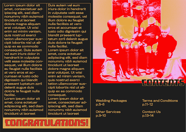
This developed design combines the successful elements from each of the initial ideas. From the first design, it takes the muted colour palette and the 3d drop shadow text boxes. From the second design, it takes the gradients and the geometric shapes. From the 3rd design it takes the logo and the typeface and from the 4th design it takes this idea of putting text in banners/boxes, uses a similar simple layout, and full bleed images will also be incorporated. For this design I completed the intro paragraph and contents to really get a feel for what it’ll actually look like. I think all the combined aspects from the initial ideas work really well together in this developed design. I like the simplicity of the layout of the cover, simply having the logo in a box in the corner, and the gradients just make it look that bit more futuristic. I also think the muted colour palette works really; I want to incorporate more geometric shapes into some of these pages, in a limited colour palette with outlined shapes and type I think the design will look very structured and mechanical. Moving forward and designing the rest of the pages, I want to be wary of the overall aesthetic - if some pages are very basic with geometric shapes and some have full bleed images on, the continuity of the design may not work as well, but I think if I get an even amount of both in the publication it will be fine, and will vary the content enough for the brochure to be more exciting to look through. 


Logo Development

I started developing my logo for the Synthetic Hearts Wedding Chapel. The original typography and banner I had worked well in conveying a futuristic wedding chapel, with a contrast of contemporary type, with banners and a high contrast serifed font. However thinking about the functionality of the logo, it needs to be simpler in oder to work on a smeller scale. So the first thing I did was change the type so that it's all Titling Gothic, I then decided to really emphasise this robot/futuristic vibe by changing the hearts to pixelated hearts. Lastly I just experimented with how far I could go simplifying the design down, removing the robot heads, using just the initials and then finally just the hearts. I think for the full logo, I will do the robot heads, with the pixelated hearts and Titling Gothic as the typeface, however I think just using the pixelated hearts is quite a good simple logo, perhaps this could be used on the back cover or on the front of the box that I will package it in. 


Synthetic Hearts Wedding Chapel - Idea 4

This last idea uses bright, full bleed images in more of an editorial magazine design. The saturated red and pink image of the robot spreads round across the front and back cover, with the title’s scale being a lot smaller in contrast, simple appearing in a banner across the bottom quarter of the front page. The inside design utilises a fairly minimal aesthetic, with the banner style repeated in the top corner of the image, almost like a comic book caption. The typeface used, Anisette, is sleek and sans serif and matches the tone of the project well. 


I really like the full bleed images and the way that little banners/type can interact with them on top of the image. Having said that, I think perhaps the actual image used isn’t quite appropriate because its the Terminator so it’s a slightly scarier looking robot, despite putting a heart over his eye. The typography works well at representing the future and technology, however similar to the last design, perhaps the inside layout could be made brighter and a bit more fun. 


Synthetic Hearts Wedding Chapel - Idea 3

This design incorporates concepts from the movie ‘They Live’ - it uses a very simple monochromatic aesthetic to demonstrate perhaps what it would be like if robots made the design, or maybe since robots are the ones who’ll be reading it, its simple because that’s easier for them to read and they don’t need particularly stylised design principles/aesthetics. Grey works really well in communicating robots because it is evocative of metal. The logo on the front works well in contrasting these slightly emotionless robot faces with the fact that they are actually in love and the hearts further this idea. Also there’s some nice textural contrast between the thresholded images and the solid type. The first typeface in the logo - IvyMode, is sleek and modern yet still a high contrast serifed font which are typically used by wedding chapels to make them appear sophisticated. The second typeface, Titling Gothic Extended (lowercase) is just very contemporary and modern, this is contrasted with the banner. The simple aesthetic on the inside provides more attention to the layout and typesetting, which is why that was taken advantage of by doing some more interesting typesetting on the left page. 


This design communicates the robot side of this project really well, but perhaps it does need some brighter colours and slightly more intricate designs just to create that juxtaposition. Nevertheless, the logo is definitely a successful part of the design which I will take forward, perhaps with some developments - I might get rid of the banner and just use Titling Gothic to simply it down. 


Synthetic Hearts Wedding Chapel - Idea 2

This idea focuses more on appearing contemporary and futuristic through the use of geometric shapes and layouts. The colour palette contributes to this concept, using red, gold and pink on a black background, with gradients creating a slightly futuristic scanned holographic feel. Fundamental geometric shapes such as semi-circles are used as a minimal way to communicate machinery and robotics and their ordered/structured layout. The typeface ‘hoverunit’ is a very stereotypical sci-fi style for a typeface. 


All in all, this design is quite successful in representing the Synthetic Hearts Wedding Chapel and what I’m trying to communicate through its design. The modular grid system, geometric shapes and symbols work really well in demonstrating a modern/futuristic aesthetic, and contrast the standard scripted type and curvy banners seen in wedding chapels today, giving it more of a robot feel. The colour palette works well, pink and red are classic colours associated with love and the gold just gives it an extra sense of class and sophistication. I also really like how the gradients work within the design. If I were to improve this design I would definitely change the typeface, it can still be something geometric and sans serif but just not something so gimmicky and obviously sci-fi. Also the image on the back cover doesn’t work well. Finally, while the black background makes the design a bit sleeker and possibly represents the ‘coldness’ of robots, I think maybe something brighter would work better. Throughout this design process, I need to not only represent robots, but also associate human processes/design sensibilities with this robotic design in order to maximise the impact. 


Monday, 29 April 2019

Synthetic Hearts Wedding Chapel - Idea 1

This design idea focuses on communicating a retro-futuristic aesthetic as a way of creating a familiar platform to communicate the future to people. The design is inspired by vintage polaroid packaging, using a rational 70’s sans serif typeface - Avant Garde, geometric stripes, drop shadows and a muted colour palette. As a symbol/logo I edited the gender symbols to have squares instead of circles, I thought this might communicate robots better, perhaps in this future, these are the gender symbols for robots. 


I like this design, the layout is clear and rational and the design aesthetic is definitely quite retro. I think to use this design however, I would have to make it more evocative of not only the future, but marriage as well. 


Tuesday, 23 April 2019

Robot Marriage - Researching and Developing the Message of the Project

As my project has progressed to the point of  creating some more in depth and developed responses, I wanted to consider the message and aim of my project, how exactly I will communicate that and what I will produce as a response. 

My project aims to communicate to people that the robotic singularity and the development of artificial intelligence is a very likely event. It doesn’t put it in a negative light, nor does it celebrate it, its purpose instead is to just bring light to it in the hopes that it’s imminence will be recognised.

Within the past couple of years, Vladimir Putin has stated that whichever country has the most developed AI, will rule the world. One of the most well known people against the development of AI is Elon Musk. Musk is constantly talking about how World War 3 will be caused by the singularity and that he thinks it’s likely that human extinction could be caused by technology. He is an advocate for having the singularity as an issue, be brought up, and for laws and regulations to be put in place. Which seems like a sensible idea. 


In my research I found that the word robot actually comes from the Czech word ‘robota’ which means forced labour. I also found the 3 laws of robotics, created by Isaac Asimov, a science fiction author:

1. First Law:
A robot may not injure a human being or, through inaction, allow a human being to come to harm.
2. Second Law:
A robot must obey the orders given it by human beings except where such orders would conflict with the First Law.
3. Third Law:
A robot must protect its own existence as long as such protection does not conflict with the First or Second Laws.

These ideas of what a robot will be in the future directly contrast views by Dr David Hanson who views robots as becoming part of society instead of being a subservient race. Perhaps this is a better view, because maybe if robots do become become forced labour, this will ultimately be the reason they might rise up and take control. Either way, for the purposes of this project, having robots as an equal part of society allows for a more engaging and shocking idea. 

Robots and Marriage
Creating branding for a wedding chapel for robots means that this idea of bringing awareness to the singularity can be communicated through a slightly more fun yet still attention grabbing platform. It also means that the project can have a social commentary on current issues related to marriage. As of April 2019, Same sex marriage is only legal in 28 different countries, yet at some point in the future, robots will be able to marry?


As a produced outcome for this project, I will produce a sort of welcome package/starter kit for this wedding chapel; it will come in a box and contain a pamphlet/publication about the chapel, as well as various other produced materials such as business cards, flyers about related robot marriage services and maybe even items such as stickers or a key chain. I want the packaging to have the feel of packaging you’d get for an iPhone or something, coming in a sleek box with everything slotted inside very efficiently - I think this will further emphasises the technological/ futuristic side of the project, yet this will be contrasted by cliched wedding imagery and colours. By creating the outcome like this, it makes the idea more immersive for whoever reads it because its as if they are being put in the position that the robots hypothetically would be. Thinking about it as a product, and how this product would communicate it’s message, as a package, it could be sold as a publication in independent book shops etc. 

Synthetic Hearts Wedding Chapel - Branding and Design Research

The initial designs I did for the business cards demonstrated a visual application of cliched wedding chapel imagery and showed slightly more contemporary design aspects starting to be applied. I want the visual identity to be more distinct and contemporary and to span over numerous touchpoint, so for that reason I have reached some contemporary designers who have created designs in line with the aesthetic I would like to achieve:

Shinzo Noda
Shinzo Noda is a Paris based graphic designer, their work displays very graphic stylised illustrations, a lot of which carry this slightly futuristic aesthetic - the netted 3d images resemble retro-futuristic graphics, as if you’d see them displayed on a monitor in a sci-fi movie. Applied to images of people, these 3d images could communicate a robot quite well. I really like Noda’s style, the images are simple and monochromatic and for that reason they’re very effective - the application of typography pushes the designs even further. If I want to show this cliched wedding chapel imagery, perhaps it could be displayed similarly to this in order for it to retain the overarching style I hope to achieve with the branding. 


Can Yang - White Tiger / Blue Dragon
Can Yang is a Chinese designer currently studying in the US. Her publication ‘White Tiger / Blue Dragon’ graphically illustrates recipes for ancient Chinese elixirs, communicated through a constant aesthetic of simple illustrations, muted colour tones, simple sans serif type combined with Chinese lettering, and more abstract geometric line drawings, combining science with folklore. The name of the publication takes inspiration from mythological creatures from Chinese folklore which represent constellations in the east and the west, which in turn, symbolises Yang being brought up in the east, but being educated in the west. I really like the design of this book - from the soft textural use of colour to the scientific diagram resembling line illustrations. The modern representation of traditional practises and folklore seems as if it would contrast, but is actually visually represented very beautifully. The busier compositions (front and back cover) slot together simple geometric devices into more complex layouts which successfully communicate the science behind these elixir recipes - design methods such as this would work really well in communicating the robot/futuristic side of the wedding chapel. While in comparison, the muted pink  and simple line drawings which represent the more delicate and ancient Chinese arts, contrast these more scientific graphic aspects in a way that would be successful in my project, contrasting robots and the future with marriage and love. 


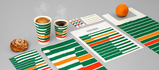
BVD - 7 - Eleven Re-Brand
Scandinavian Design Agency BVD’s Rebrand of 7-Eleven puts to bed any preconceptions of 7-Eleven being a greasy American chain restaurant and rebrands the stores as slick, modern coffee shops with this striped retro-futuristic design. Each element of the branding ties in perfectly with the overall visual identity, providing an effortless continuity. The striped aesthetic and strict green, red and orange colour palette attain a geometric vintage aesthetic. I really like the design of this rebrand, thinking about my project, a retro-futuristic approach could be very appropriate because it’s very applicable to representing the future. In popular culture and movies a lot of the interpretations of the future that we see are retro-futuristic because everyone is so familiar with older movies such as blade runner or alien etc. For this reason, a retro-futuristic approach might be the most familiar way to introduce ideas of the future. While this project does intend to communicate the imminent singularity and robots becoming sentient, which is a serious issue, it does so through using a slight less serious tone, and therefore this approach could be very effective.