The initial designs I did for the business cards demonstrated a visual application of cliched wedding chapel imagery and showed slightly more contemporary design aspects starting to be applied. I want the visual identity to be more distinct and contemporary and to span over numerous touchpoint, so for that reason I have reached some contemporary designers who have created designs in line with the aesthetic I would like to achieve:
Shinzo Noda
Shinzo Noda is a Paris based graphic designer, their work displays very graphic stylised illustrations, a lot of which carry this slightly futuristic aesthetic - the netted 3d images resemble retro-futuristic graphics, as if you’d see them displayed on a monitor in a sci-fi movie. Applied to images of people, these 3d images could communicate a robot quite well. I really like Noda’s style, the images are simple and monochromatic and for that reason they’re very effective - the application of typography pushes the designs even further. If I want to show this cliched wedding chapel imagery, perhaps it could be displayed similarly to this in order for it to retain the overarching style I hope to achieve with the branding.
Can Yang - White Tiger / Blue Dragon
Can Yang is a Chinese designer currently studying in the US. Her publication ‘White Tiger / Blue Dragon’ graphically illustrates recipes for ancient Chinese elixirs, communicated through a constant aesthetic of simple illustrations, muted colour tones, simple sans serif type combined with Chinese lettering, and more abstract geometric line drawings, combining science with folklore. The name of the publication takes inspiration from mythological creatures from Chinese folklore which represent constellations in the east and the west, which in turn, symbolises Yang being brought up in the east, but being educated in the west. I really like the design of this book - from the soft textural use of colour to the scientific diagram resembling line illustrations. The modern representation of traditional practises and folklore seems as if it would contrast, but is actually visually represented very beautifully. The busier compositions (front and back cover) slot together simple geometric devices into more complex layouts which successfully communicate the science behind these elixir recipes - design methods such as this would work really well in communicating the robot/futuristic side of the wedding chapel. While in comparison, the muted pink and simple line drawings which represent the more delicate and ancient Chinese arts, contrast these more scientific graphic aspects in a way that would be successful in my project, contrasting robots and the future with marriage and love.
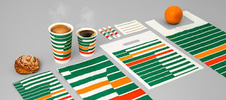
BVD - 7 - Eleven Re-Brand
Scandinavian Design Agency BVD’s Rebrand of 7-Eleven puts to bed any preconceptions of 7-Eleven being a greasy American chain restaurant and rebrands the stores as slick, modern coffee shops with this striped retro-futuristic design. Each element of the branding ties in perfectly with the overall visual identity, providing an effortless continuity. The striped aesthetic and strict green, red and orange colour palette attain a geometric vintage aesthetic. I really like the design of this rebrand, thinking about my project, a retro-futuristic approach could be very appropriate because it’s very applicable to representing the future. In popular culture and movies a lot of the interpretations of the future that we see are retro-futuristic because everyone is so familiar with older movies such as blade runner or alien etc. For this reason, a retro-futuristic approach might be the most familiar way to introduce ideas of the future. While this project does intend to communicate the imminent singularity and robots becoming sentient, which is a serious issue, it does so through using a slight less serious tone, and therefore this approach could be very effective.


No comments:
Post a Comment