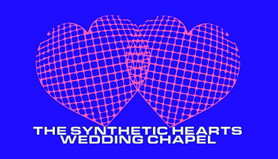
As well as being able to vote, another prediction from Dr David Hanson was that by 2049, robots will be able to marry. This seems like such a far fetched concept, considering a robot with emotions and that can love because for so long robots have been considered cold and emotionless. Perhaps for this reason a project focused on it would be very effective. It could also bring to light current issues in our society related to marriage such as debates and controversy related to gay marriage. As a race, how can we supposedly be close a time when robots can marry, yet still some humans aren’t aloud to marry whoever they would like? To explore this concept, I intend on designing and branding a robot wedding chapel.
To make the design of this idea as effective as possible, the best way to do it would be to amalgamate stereotypical imagery and type related weddings and love and used by wedding chapels in their own branding with a more futuristic robotic aesthetic. I like the idea of doing a wedding chapel because they are often less stylish and sophisticated and more gimmicky and cheesy, allowing for an aesthetic which heavily uses very appropriate imagery. It would als0 add an element of humour in which could be quite effective. I researched a few las vegas wedding chapels and looked at their websites:
The imagery on the sign for ‘A Little White Wedding Chapel’ is exactly the sort of style I intend on combining with a robot futuristic style - scriptive type, hearts, ribbons and banners etc. A las vegas wedding chapel lends itself to the theme well because they are often themed and a little bit weirder so having a wedding chapel entirely for robots seems like something which would be appropriately set there.
These business card initial designs demonstrate an application of relatable imagery, sci-fi/contemportary typography and appropriate colour combination, utilising pink as an evocative colour of love with another colour such as blue, green or red, creating a contrast. I think the most successful is the first one (green text on pink) as it is a bit more subtle yet the typeface Vidange Pro, is still very contemporary and almost quite futuristic.
This idea definitely excites me the most out of the 3 that I’ve explored so for that reason I will carry on visually exploring it. I think this idea works the best because it communicates the overall message clearly, it has a lot of potential for suitable imagery and type and also it has a lot of potential in terms of produced outcomes. I will endeavour to now explore the most suitable, attention grabbing and effective style of design to communicate this message, and furthermore, how I will communicate it.


No comments:
Post a Comment