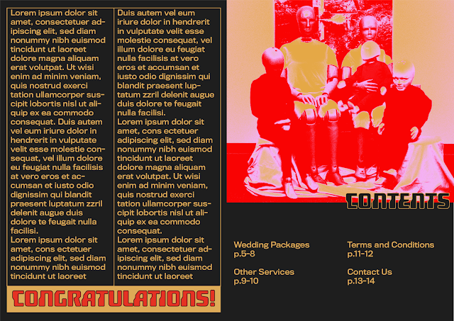
This idea focuses more on appearing contemporary and futuristic through the use of geometric shapes and layouts. The colour palette contributes to this concept, using red, gold and pink on a black background, with gradients creating a slightly futuristic scanned holographic feel. Fundamental geometric shapes such as semi-circles are used as a minimal way to communicate machinery and robotics and their ordered/structured layout. The typeface ‘hoverunit’ is a very stereotypical sci-fi style for a typeface.
All in all, this design is quite successful in representing the Synthetic Hearts Wedding Chapel and what I’m trying to communicate through its design. The modular grid system, geometric shapes and symbols work really well in demonstrating a modern/futuristic aesthetic, and contrast the standard scripted type and curvy banners seen in wedding chapels today, giving it more of a robot feel. The colour palette works well, pink and red are classic colours associated with love and the gold just gives it an extra sense of class and sophistication. I also really like how the gradients work within the design. If I were to improve this design I would definitely change the typeface, it can still be something geometric and sans serif but just not something so gimmicky and obviously sci-fi. Also the image on the back cover doesn’t work well. Finally, while the black background makes the design a bit sleeker and possibly represents the ‘coldness’ of robots, I think maybe something brighter would work better. Throughout this design process, I need to not only represent robots, but also associate human processes/design sensibilities with this robotic design in order to maximise the impact.


No comments:
Post a Comment