One of the first developments that went well was warping the type slightly - I was cautious about this because obviously showcasing the typeface is quite important and I didn’t want it to be modified too much, however with a small lower arch warp, it just makes the composition a little more visually intriguing and references psychedelic posters a little bit. I also tried out a banner on the ’50 years of abbey road’ but it looked a bit naff, I thought it would highlight the celebratory tone of the posters but it’s a visual device which has been used a lot so decided against it.
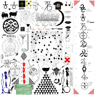
The next developments were informed by some research on Eric Timothy Carlson’s design for Bon Iver’s album ’22 a Million’. The album artwork and supporting designs are incredibly impressive and I first saw them in Creative Reviews top album artwork of 2017. The black and white album sleeve contains all sorts of symbols, glyphs and little images, which correspond to themes and different songs, which Carlson worked a lot with Justin Vernon, singer and songwriter of the band, to design. The range of different symbols, images and type clustered tightly into the design just creates something incredibly intriguing to look at, every time seeing something completely new. The deluxe edition of the vinyl contacts this intricate design with a fairly simple yin and yang design, applying red and gold with great effect.
The Yin and Yang symbol has been associated with the Beatles before, when they’ve produced more spiritual world music on some records. It seemed like a perfect visualisation of the contrast and harmony thats part of the concept of this project. I tested it out and soon settled on a simple kind of half and half design, not using the curves or the circles; visually and conceptually, this is subtle and doesn’t overtly scream out the yin and yang symbol, which is good because obviously its very recognisable and I wouldn’t want integrating it into the composition to take over the design.
Soon after this, colour was tested in the design. Red worked quite well which was first tested as its present on road signs so it links quite well. Then green was tried out with it, which is its inverse colour, therefore they have a high contrast (linking to the concept) and visually are bold next to each other. At first these 2 colours were used just on the bottom two rows of smaller type but it actually ended up working quite nicely for the bigger type as well. The zebra crossing shapes were changed from outlines to filled in shapes to increase the contrast in the design as well.


No comments:
Post a Comment