OUGD406 - Initial J - Card Designs/Ideas
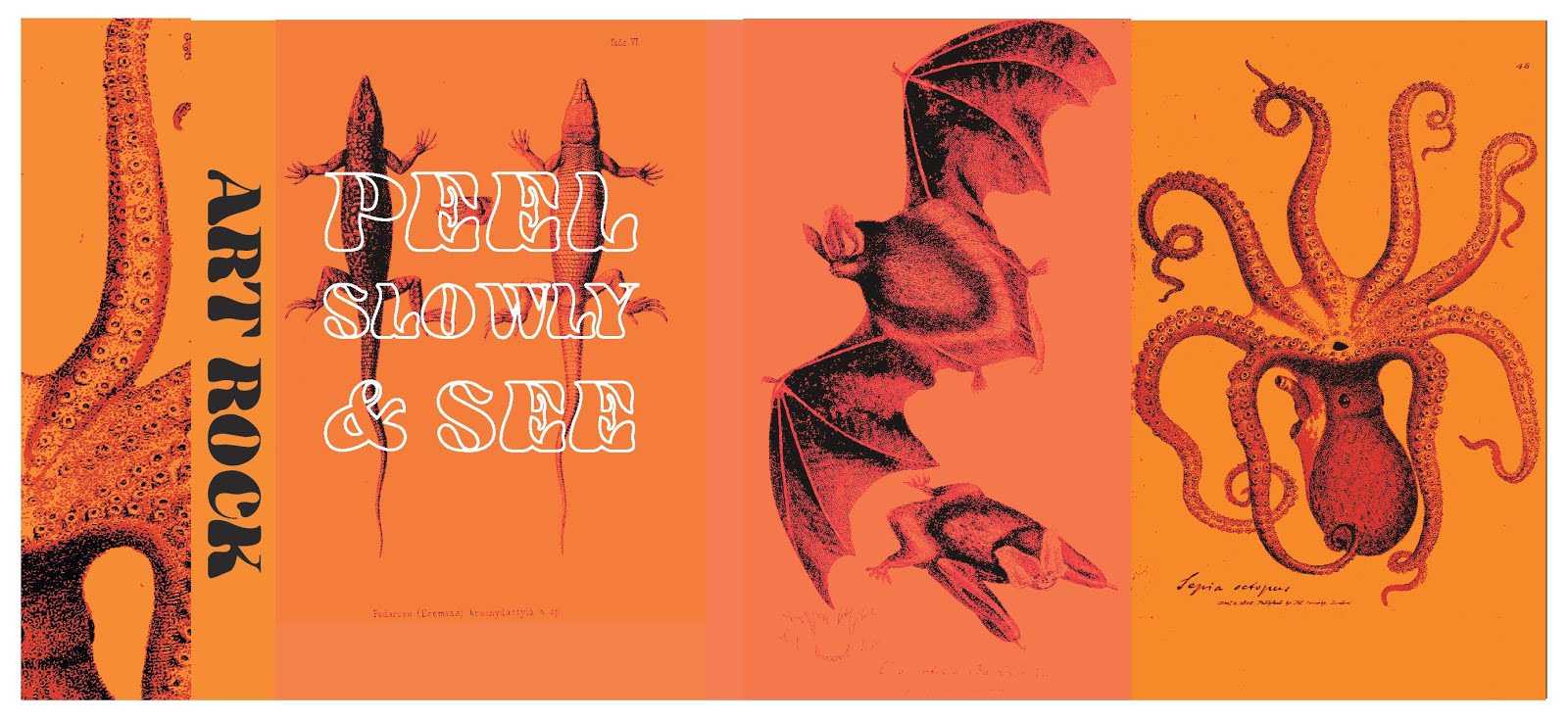
The Sgt Pepper’s Lonely Hearts club band song - “Good Morning Good Morning” was inspired by a TV commercial for Corn Flakes, and at the end, there is a series of animal noises. At Lennon’s request, the animals appear in a specific sequence: with each one large enough to devour the last. This design utilises vintage etched drawings of animals from the British Library to communicate this idea. Orange is utilised in reference to the line from from Lucy in the Sky with Diamonds - ‘With tangerine trees and marmalade skies’. This colour combined with black was utilised in a flag design and was found to be both refined and in keeping with art rock as a micro-genre. Arabesque is used as the typeface because it is psychedelic and reminiscent of the era, it is effectively a placeholder for a typeface which will be created however does work with effect. The title on the front - Peel Slowly and See - is a reference to the cover for The Velvet Underground with Nico where those words appeared small on the cover next to the banana image which was a sticker on the original vinyl. The title appears in a white outline in order to contrast from black in the background and the type saying art rock on the spine is black and filled to contrast this. This design looks good and is grounded well in research, however lacks a certain amount of experimentation and process. If it were to be carried forward, with a few minor tweaks such as the hues of orange being matched, the animal images could be experimented on to produce a more exciting and effective composition.
This idea is based upon how there was a conspiracy theory when Dark Side of the Moon was released that if it were played whilst watching the Wizard of Oz, the two correlated. This was denied by Pink Floyd, however many still believe it because of coincidental links such as the song Brain Damage playing at the same time the scarecrow enters the film. This design visualises this idea, placing song names onto the characters they correlate with. Green is used as a colour to reference the emerald city and this is paired with black for a sharper more dynamic composition as well as the fact that black is used in a lot of rock album covers, including Dark Side of the Moon. The typeface Juniper is used again because its psychedelic but also acting as a placeholder for a typeface that will be created.

This J-Card design combines images of unusual object used in the recording of art rock songs, Bryan Wilson’s two dogs are also represented as their barking is featured at the end of the Beach Boy’s song - Caroline, No. This idea plays with block colour as a reference to pop artists such as Andy Warhol and the random collection of objects references Peter Blake’s work well. The Psychedelic typeface Siegfried is used, again utilising ‘peel slowly and see’ as the title. A group critique indicated this design was the least successful because even though it is well researched, the design is not as refined and sophisticated as it could be. If it were to be taken forward, suggestions were to rationalise the colour and maybe utilise white space a bit more. To this effect, the images could be laid out subject to the actual panels a bit more.

A really good idea from the group critique pointed out that all the designs utilise interesting bits of research, so facts could be found for each song on the tape and could be each given a panel, creating a larger fold out J-Card. This would be interesting because it would create more room to experiment with and really embody the art rock principle of creating something more avant-garde and complex.
No comments:
Post a Comment