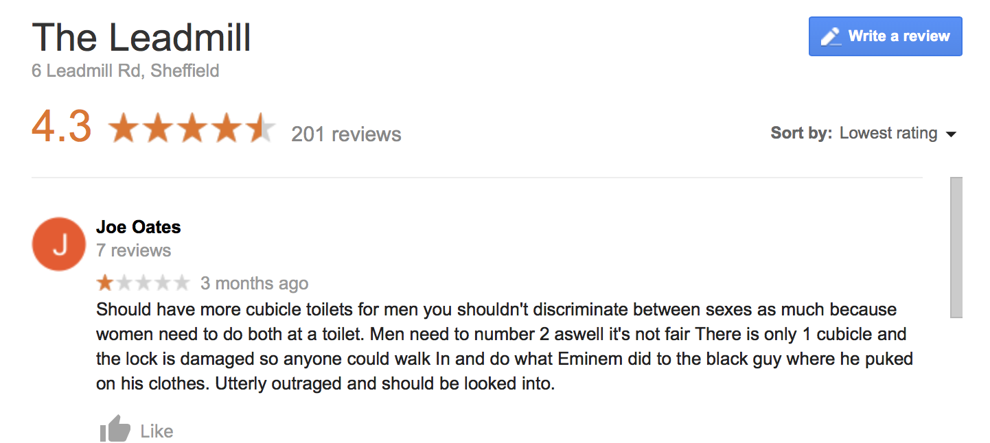
Upon researching the idea to use funny bad reviews of clubs in sheffield and searching through reviews to find good examples, the results are very funny and its evident that they would work in a publication with effect. Thinking practically about how they can be designed to the standard of a high quality publication, there are a few things that could be experimented with:
- Using the existing design and typography of the club in order to accurately visually represent it. Its interesting to consider not specifying what club each review is for and the reader would have to guess from context and design which club it is. Of course then the target audience would have to be people from sheffield.
- Using the context of each review or specific things from that review to inform its typography, for example if a review said “Bit sticky” the type could be manipulated or specially made to visually communicate this.
What is the Book Communicating - and Who to?
This book would be purely for comedic entertainment, it would be most effective for people who are from sheffield and have been to the clubs who can relate, however when people not from sheffield read them, they still find them funny. Another thing the book would demonstrate is interesting and effective design and typography, so to this effect, the book may appeal to graphic designers.
What’s the Message? Why is it Important?
The book wouldn’t have a strong message for readers to take away as it’s for entertainment purposes. When reading through the reviews, you’re either reminded of how stupid some people can be sometimes, or how badly people can be treated by staff and bouncers at clubs.


No comments:
Post a Comment