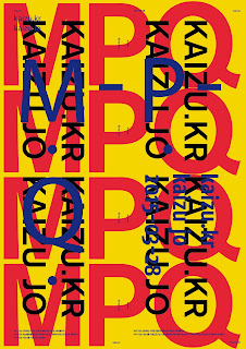
Repetition in design as a visual device is becoming increasingly more popular. It’s a bold way to display type and ensures anyone seeing the poster has definitely read it. It’s also a really good way to fill the space without having to have massively bold type that with words split over multiple lines. Joong Hyuncho is a South Korean designer who who uses repetition a lot in his designs;
This bold design repeats itself in various places, creating an almost more harmonious structured grid like composition. Type of different colours repeats and overlaps one another. The use of 3 primary colours really makes the type stand out from each other.
I like this poster but perhaps the idea of repetition takes over from the actual message of the poster, theres so much type that it’s almost too convoluted for it to be readable to someone passing by. Having said that, it is in a different language so I can’t read it anyway. I think for my poster to make it more readable, I will have just one phrase repeated, with the other type not overlapping it to such a degree.
This Kanye West album cover designed by Peter de Potter uses fairly extreme repetition with smaller type, making the design almost textural or pattern like and gives less priority to the readability of the type.


No comments:
Post a Comment