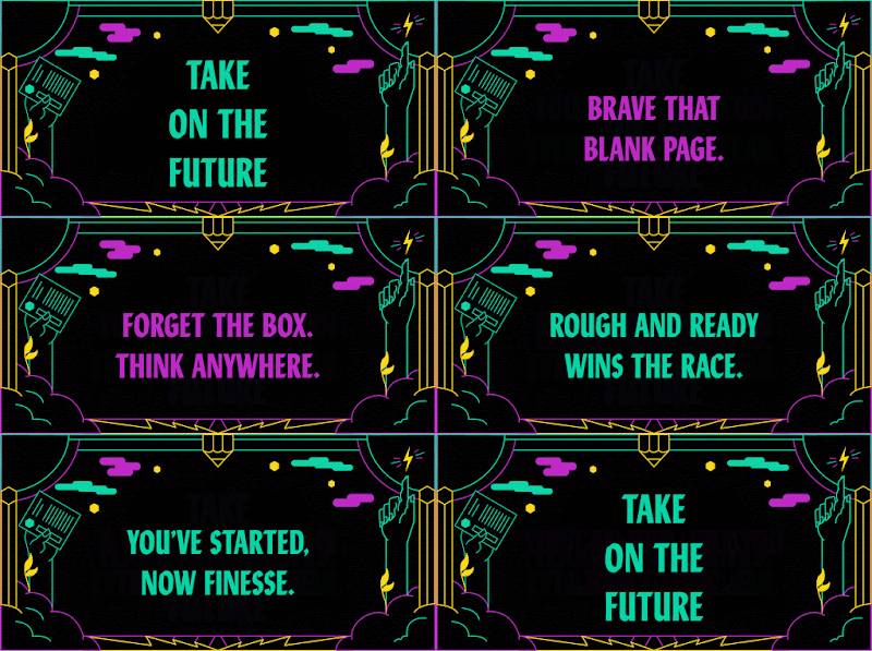
After creating quite a few initial ideas for posters and visual identity for various ideas from my creative ad collaborators, we had finally decided on the idea and exact copy for the branding. The theme of the branding is ‘Witness the Future’ and the copy will read:
You are forward thinking
The creators of the cutting edge
You are bold non-conformists
The pioneers of creativity
So are we,
And we are ready
Witness the future.
The idea behind the ad is to speak directly to the creative industry, telling them basically why they should come to the exhibition, because the students at LAU are the future, they are all these things that people in the industry are.
Despite this being a new idea, the theme is still very similar to the other ideas explored so far, meaning the research undertaken will still be applicable. In terms of the design, the idea of making the posters bold and eye catching is still the priority so similar design ideas and visual devices already explored can be experimented with.
One of my creative ad collaborators suggested using this D&AD New Blood branding as inspiration which has a similar message and idea behind it. It is quite bold and eye catching, which could be down to the use of a few bright neon colours on a black background which really makes them pop. The typeface is also quite stylish and contemporary which is important because it informs the tone of voice of the add, and in this case makes it look fresh and modern.
Moving forward with creating some more finalised initial ideas, here is what I will consider for different visual elements
Typography - The typeface needs to be bold and eye catching, like the D&AD New blood branding, if you use a contemporary typeface it’ll convey the right tone of voice. It also needs to be fairly easily readable so people walking past the poster can instantly read it, I have been using Titling Gothic Extended and Avians Flare so far which have worked well. Also something to consider is that the poster has a lot of copy so it’ll be very type heavy.
Colours - I’ve been suing bright colours so far so that the branding is eye catching, I’ve been using gradients as they often appear bolder than one spot colour when prince din CMYK. It would be interring to try out coloured type on a black background so the the type stands out, like the D&AD branding. Red is the most eye catching colour so that would be good to use and would be rationalised well, also a bright blue would be good as it matches to the tone of the future and being modern and cutting edge.
Layout and Imagery - The Layout will be fairly simple; the posters will be very type heavy so probably will not have any imagery on. I want to keep the layout of the type fairly simple so its easy to read and the visual hierarchy is clear.

No comments:
Post a Comment