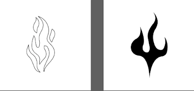
Light Cigarette - I experimented with simple line drawings of flames. I like the visual quality of the outlined flame because it offered variation from a lot more of the solid symbols. I also like how it is slightly more intricate.
Fox - These symbols show a detailed symbol of a fox, taken from a photo, and an abstract version simply showing the eyes, as that is often what you see in the dark. The triangle shape represents the motion of the fox and the shape of its head. I think I prefer the detailed fox, the texture of the thresholded image will contrast more geometric symbols nicely.
Slippy Road - I looked at paving stones and how perspective can give them a diamond shape and used this. The first design simply incorporates water drop shapes whilst the second is made up of 4 paving stones and is warped to represent the slipperiness. The second one looks too much like the windows symbol, and I do like the water drop symbols in the first.
Music Up - The first symbol is inspired by musical notation with the f meaning forte, which means play louder. It is in black letter because it’s often seen like that in musical notation. The second symbol is a more obvious representation, I definitely prefer the first.
Otley Runners - When I pass otley runners on this route, its on headingley lane and they are inbound to Hyde park pub, therefore in-between the 8th and 9th pubs on the route. I combined these numbers in a ligature with a circle to contain it, I personally prefer the first one which uses the typeface ‘Vidange’ because it has a more interesting form and is less obviously an 8 and 9.
Music Down - Opposite of music up, this time with a p meaning piano - player quieter.
Cool Modern House - These two geometric symbols are traced from a photo of the house, the first being a chair on the balcony and the second being part of the architecture. The simplicity of the first one works better, with more consistent line weight and a more ‘logo’ like aesthetic.
Stressful Drive - Whenever we’re on this drive, I always think the cars are gonna hit each other or clip each others wing mirrors, so used the shape of a wing mirror for this, I think the first one communicates with more clarity the idea of the mirrors hitting each-other.
Narrow Path - There is already a similar ordinance survey symbol for this, I decide to use brackets to maintain the visual consistency with other typographic symbols. The first ones are definitely more intricate and interesting to look at, and because the route isn’t straight its a bit more irregular and winding, the form of these brackets work better.
Tree Stump - Theres a tree stump which always sticks out on this route which I am wary of when walking. The upside down v represents this very simply and minimally, the second design does a similar thing, but I think it’s too reminiscent of a wave like in the Pepsi logo.
Cool Window - I did a line drawing of this circular geometric window, the slightly more intricate one is probably more interesting to look at.
Electric Unicycle Guy - This guys always whizzes past on his electric unicycle in the morning, to represent I created another ligature, combining a 1 with a circle, representing the 1 wheel, but also almost visually illustrating the 1 as if it is the guy on the unicycle, with the curved line showing motion. If I put it in a circle, it will be visually consistent with the other ligature I did.
Cut Over the Grass - This is a very minimal symbol, representing the geometry of the decision to cut across the grass, being a shorter distance to walk. The first symbol demonstrates better the idea of walking all the way across because the line meets up with the other side.
Cool Graffiti - I always notice this graffiti on this walk, I took a picture of it and drew out some of the shapes. The first will probably work better as a symbol because it is simpler and cleaner, it also kind of looks like the nose on a skull which I always think when I see it.
Billboards - I edited my tiger tattoo design form this, one with the whole tiger and one with a section in a square, the first one will probably work better as its interesting to have a fully illustrated image, creating some contrast to other symbols.
Cash Machine - This first ligature combines the letterforms in ‘£10’ because we always withdraw £10 at this cash machine, again I added in the circle to take on the aesthetic of the other ligatures in the set of symbols.
Start Talking About Pool - I thought an 8 ball would represent this one best, its nice to have a variation of abstract symbols with meanings behind different shapes, strokes etc. and then more obvious illustrations/interpretations. For this reason I prefer the first 8 ball.
Passing Royal Park - Royal park is always really really busy with students. The first symbol represents spilling drink and there general mess there, the second represents having to buy 3 pints at once because the bar is always so busy. I think the first symbol works better because it matches the tone better, the second symbol is too ordered and structured.


No comments:
Post a Comment