Pubs, Bars and Clubs in Sheffield
Context: Sheffield is a fairly large city with quite a vibrant night life, it is commonly associated with an indie scene. Despite this, this project does not focus on how Sheffield as a location has informed the typography of these bars, pubs and clubs, it more so uses sheffield as a backdrop to examine the differences in typography between these different drinking establishments, minimising the quantity of different variables which might arise comparing the type from different cities or locations.
Pubs: The largest factor which informs the typography of a pub, bar or club is it’s individual style or theme, and this is most commonly informed by the sort of music they play, the age range of people who go there and the type of drink or sometimes food they serve. While pubs commonly play music, it is not loud and is not a key feature of the experience there, people go to the pub for a quieter drink and maybe food. Other factors to consider with pubs are that often they are older establishments and cater to an older age range of people as well as younger people.
When examining these different examples of pub typography, a few patterns can be discerned; firstly, simple serifed type is often utilised because it is not particularly stylised however it does demonstrate the heritage of the pub, and also make it look a bit more sophisticated. Another trend in pub typography is to retain and older style of type, but modernise and refresh the pubs image by making it look vintage or retro, appealing to both a younger and older audience. This is often done by using decorative type, wall stickers or chalk drawn type.
Bars: The typography for bars ranges the most, this is because they have varying atmospheres, some being closer to a pub and some livelier bars being more like a club. Theres also a lot of themed bars which use specific typography to demonstrate that theme.
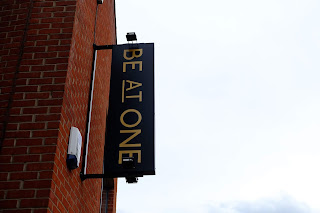
A lot of modern bars utilise a bold minimal look, adopting a typeface such as Helvetica for a clean and simple sign which is bold, highly legible and not overly stylised. Interestingly enough, a lot of bars and live venues which play more alternative music, such as indie or rock, commonly use a slightly narrower sans serif font. This narrower type has maybe over the years become associated with this style of music because of removable letter signs on live venues, which are still used to this day, or through letter-pressed rock and roll posters which often used a narrower typeface.
Finally, in more expensive, slightly more upmarket bars, a tendency towards serifed type can be seen, giving them that air of sophistication. The Great Gatsby (fig1) is cocktail bar, however utilises modern illustrative type to achieve a sophisticated look.
Clubs: The tendency to use bold sans serif type seen with bars is again seen with clubs a lot, and practically all of them happen too be white text on a black background. These are the clubs which play mainstream, dance, baseline style music so this minimalist approach ensures to draw in a wide audience as its bold and not stylised to the point where it’d deter any sort of people.
Other clubs have more distinct uses of type which work specifically for their own styles; Corporation (fig2) is a large club which does different nights playing different genres of music however it is primarily associated with rock music and has live bands playing, this style is demonstrated by using a narrow sans serif typeface in italics to make it look dynamic. The Leadmill (fig3) is a rock indie club which also has live bands playing and visualises this style by using a neon sign and a retro outlined typeface combined with a scriptive font.


No comments:
Post a Comment