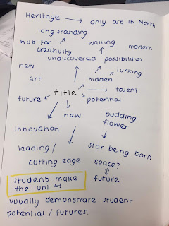
I met up with my group and we discussed initial ideas for the concept of this campaign. Even though I man taking more of a designer role in this collaboration, I still want to be involved in the idea making process so that when it comes to designing, I am more well informed on the concept, allowing for more concise design ideas.
We went through various ideas and angles we could take for the brief, including:
- promoting the idea that theres so much talent to uncover and potential in each student, which would appeal to people in the creative industry.
- Promoting the heritage of the uni and talking about how its been this long standing creative hub.
- Touching upon how its the students that make the uni.
- Trying to represent innovation and cutting edge ideas.
My Idea - “Fortune Favours the Bold” - Courageous action is often rewarded. The phrase encourages people to do what scares them. A variation is "fortune favours the brave”. Leeds Arts University has many great qualities and principles which could be touched on but fundamentally, in one word, it’s creative. The phrase fortune favours the bold really exemplifies how the students at this university are all creative and being creative and expressing yourself is bold and takes courage. This is a great quality to promote and the first part of the phrase also hints towards success which is a good positive message to send, especially to potential employers.
Visual Ideas - The phrase itself comes from latin so it has a historical context behind it. Visually, design elements such as typography will have to be big and bold and colours could be bright. The idea of being brave in this historical context almost imbues images of heroes, maybe metal textures could be used as a reference to this, this would work well as metal beveled/embossed type is quite popular in contemporary design right now.
These initial designs experiment with the ideas stated above. I like the metallic type but I think perhaps if the campaign is to be more representative of the whole uni and appealing to a m ore general audience, perhaps it could be considered more. The background works well as having a bold red/orange gradient makes it look a quite bright and dynamic as opposed to one spot colour which could come out looking a bit flat. I like the idea of adding in the images and arranging them in interesting layouts with the type. If I want to refine this and push it further I should come up with a grid system to place them on, however I do really like the combination of the phrase along side the images as it gives the poster a bit of narrative and emotion.


No comments:
Post a Comment